Tagarno

in short

Redesigning Tagarno's digital microscope interface

  • Type: Client project via Artlinco A/S
  • Role: UX/UI Designer
  • Year: 2023
  • Team: Industrial designers (hardware), me (digital UI)
  • Key work:
  • TASK ANALYSIS
  • MENU AUDIT
  • WIREFRAMES
  • PROTOTYPE

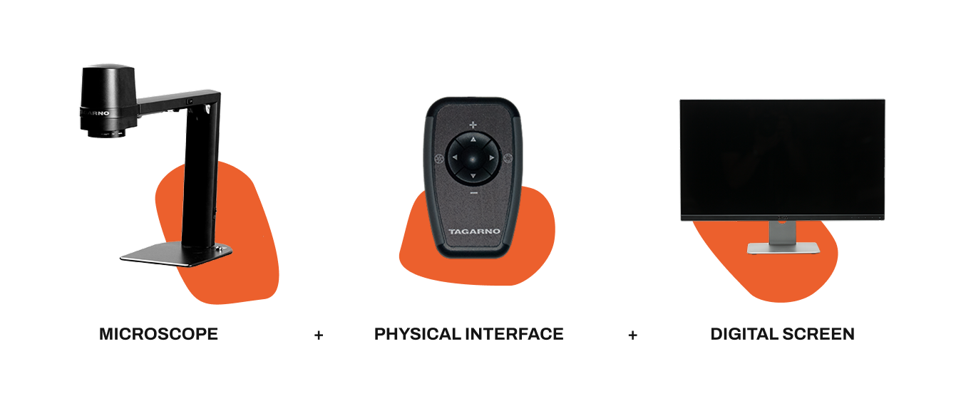
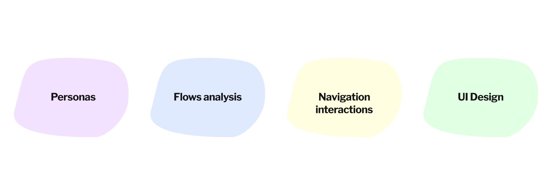
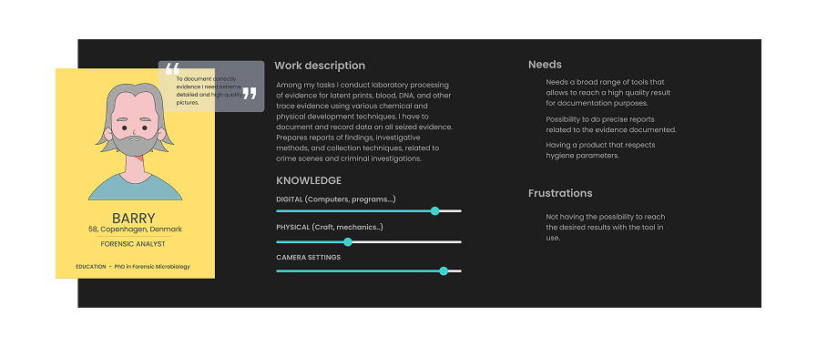
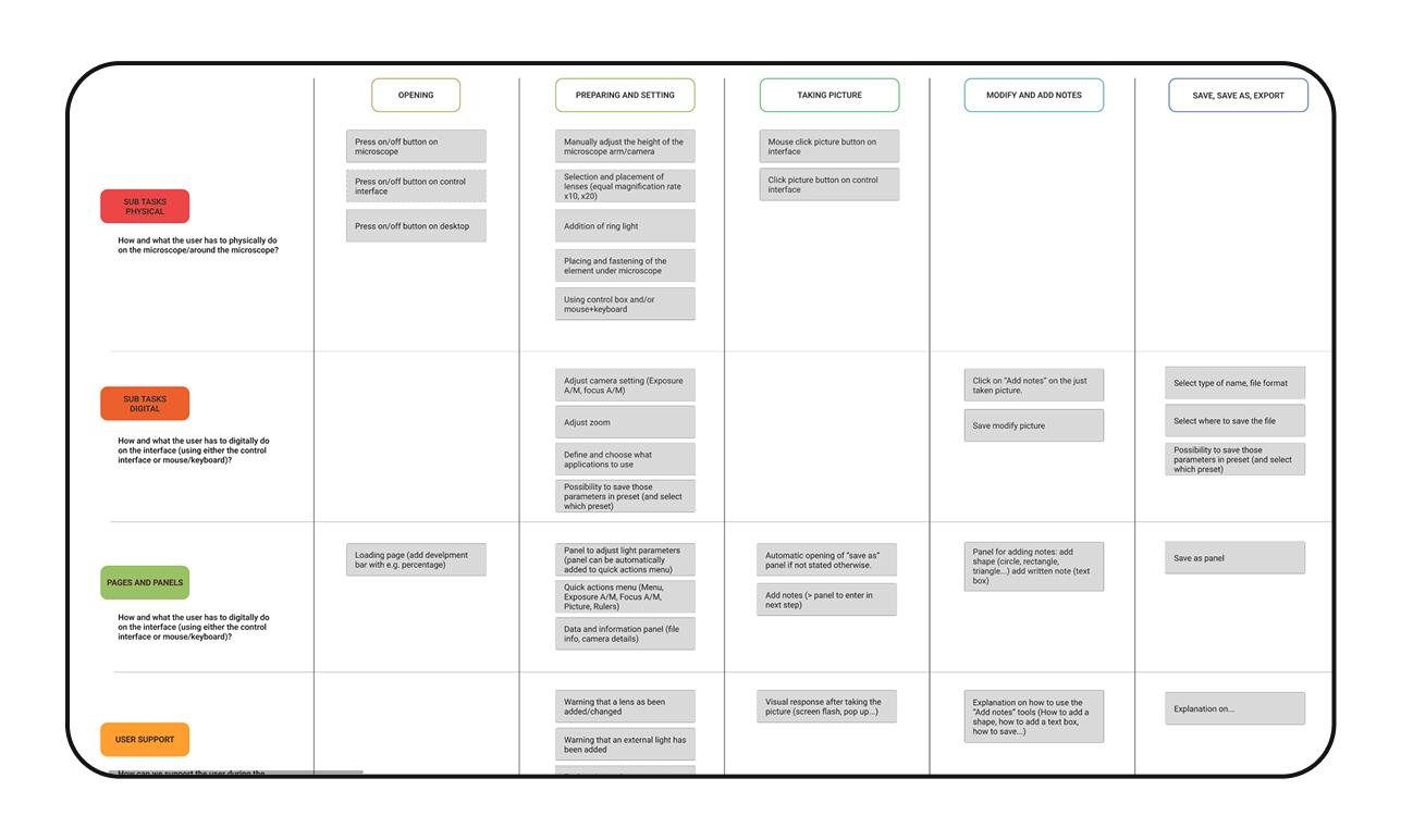
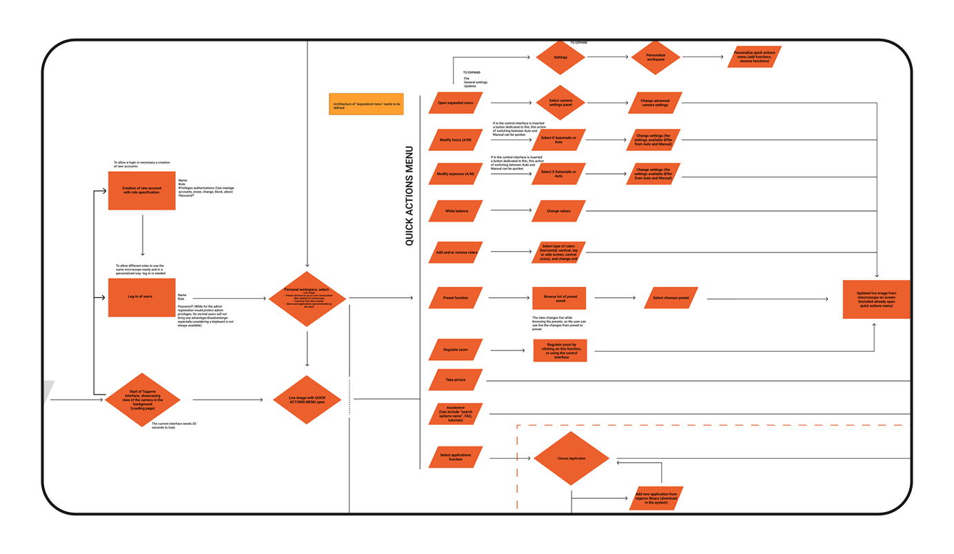
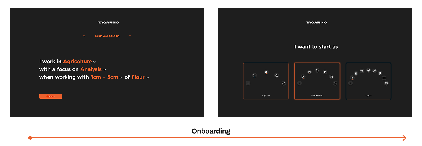
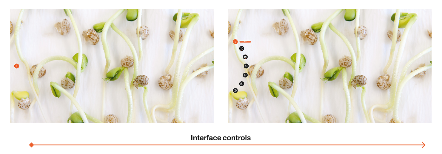
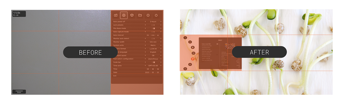
Tagarno launched a new flagship digital microscope with a cutting-edge physical redesign. The challenge: its interface was outdated and hard to navigate, especially given that users interact through multiple input modes (custom control box, mouse, keyboard). I conducted tasks and flows analyses, menu audits, then designed a new interface architecture and interaction model that works seamlessly across inputs. The result was a more intuitive and scalable interface for industrial, forensic, and electronics assembly contexts.

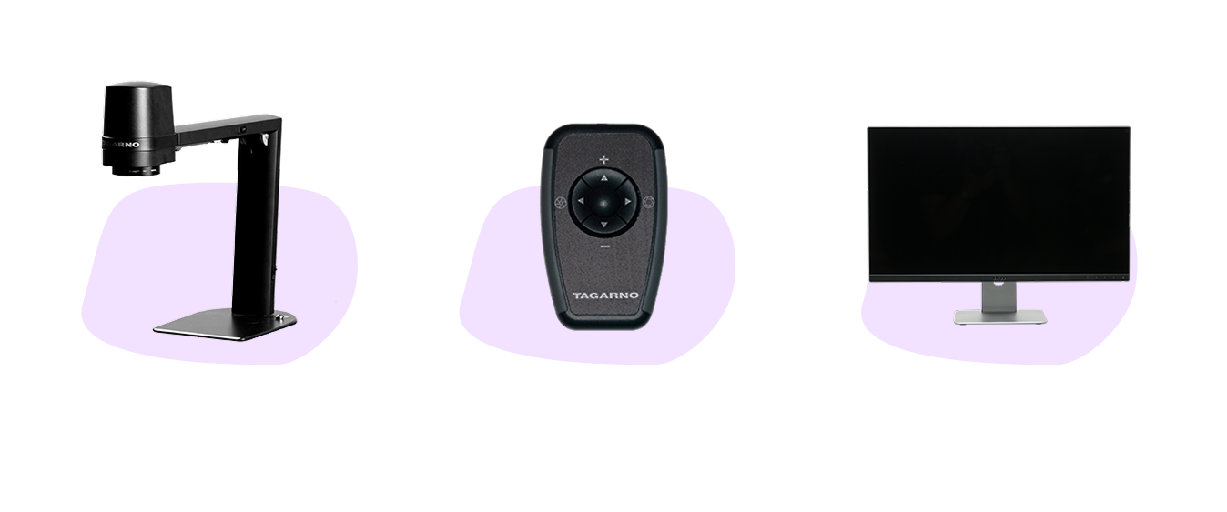
Design had to unify physical and digital interactions

Mock up of the new interface

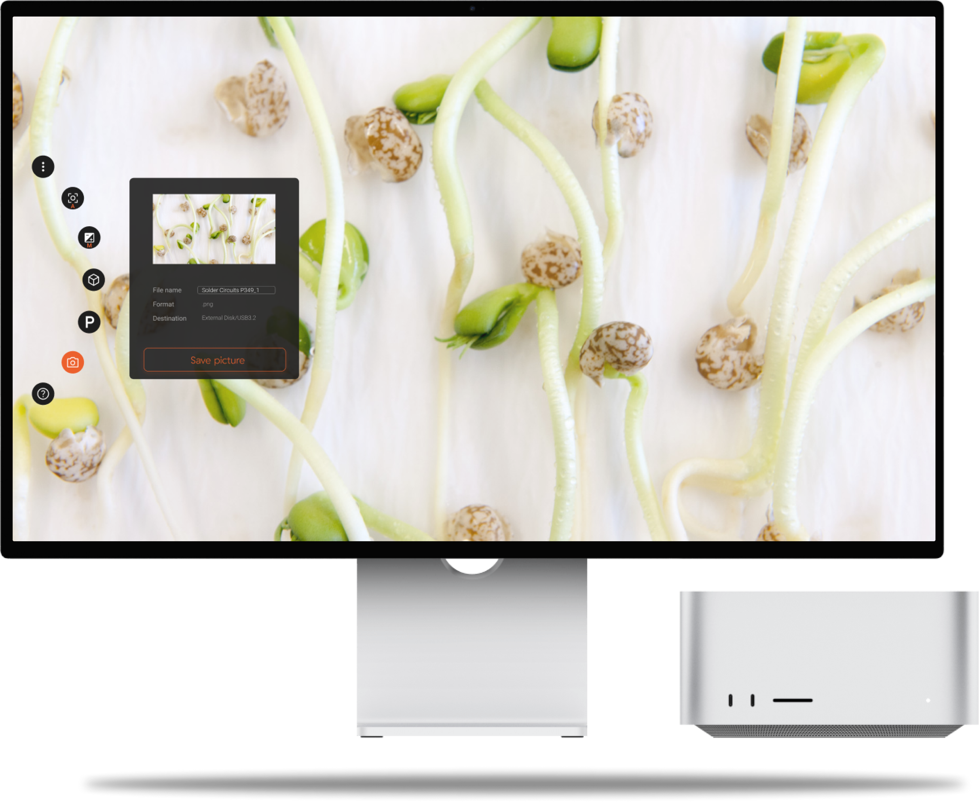
Final concept balanced clarity and flexibility

Scroll down to know more

or

GO BACK TO HOMEPAGE

Tagarno

deep dive

Tagarno needed its new flagship microscope to pair a modern industrial design with a completely rethought digital interface.

My task: make the UI usable across multiple input modes (dedicated control box, mouse, keyboard) and align it with real-world workflows.

Project scope: research, optimisation and redesign of the digital interface alongside new hardware

Context & Challenges

The existing interface was:

  • Visually outdated and inconsistent.
  • Overly complex menus with poor hierarchy.
  • Difficult to use via the control box.

The challenge was to create an interface that felt modern, efficient, and scalable, while being intuitive for both expert users (forensic analysts) and technicians (assemblers).

Balancing physical hardware controls with digital UI design

My Role & Responsibilities

  • Built personas (forensic analyst, electronics assembler).
  • Performed task and menu analysis to uncover inefficiencies.
  • Created flowcharts and application maps (focus stacking, rulers, overlays).
  • Designed navigation architecture and quick actions menu for faster access.
  • Delivered wireframes + documentation for handoff.

Ownership from research through redesign

Research & Insights

Findings from research and analysis:

  • Inconsistent menus made navigation confusing.
  • Too many steps to complete simple actions (take photo, save/export).
  • Different users had different needs:

    Forensic analysts → advanced documentation, high-quality reporting.

    Electronics assemblers → quick checks, speed over detail.

Advanced needs: detailed reports, precision, documentation

Task mapping revealed excessive steps and inefficiencies

Design process

To address these issues, I:

  • Consolidated core functions into a redesigned quick actions menu.
  • Streamlined menu depth and grouped functions logically.
  • Introduced contextual support (tutorials, tooltips, live feedback).
  • Proposed personalization features (basic/advanced modes, presets).

Structured new menu architecture

Consolidated critical actions into a simplified flow

Solution

The redesigned interface:

  • Provides quick access to core actions (focus, exposure, capture, notes).
  • Adapts across input methods (control box, mouse, keyboard).
  • Supports different user profiles (basic vs advanced views).
  • Offers contextual guidance (live prompts, tooltips, tutorials).

Outcomes & Impact

Reflections

  • Usability improved: clearer menus, faster workflows.
  • Consistency achieved: digital and physical interfaces aligned.
  • Scalable design: prepared for future applications (measurement, overlays).
  • What worked: Task analysis + menu audit clarified user needs early.
  • Challenge: Balancing simplicity vs. advanced controls for very different users.
  • Next step: Full usability testing with production hardware.
Would like to hear more about this project?
Let's have a chat!