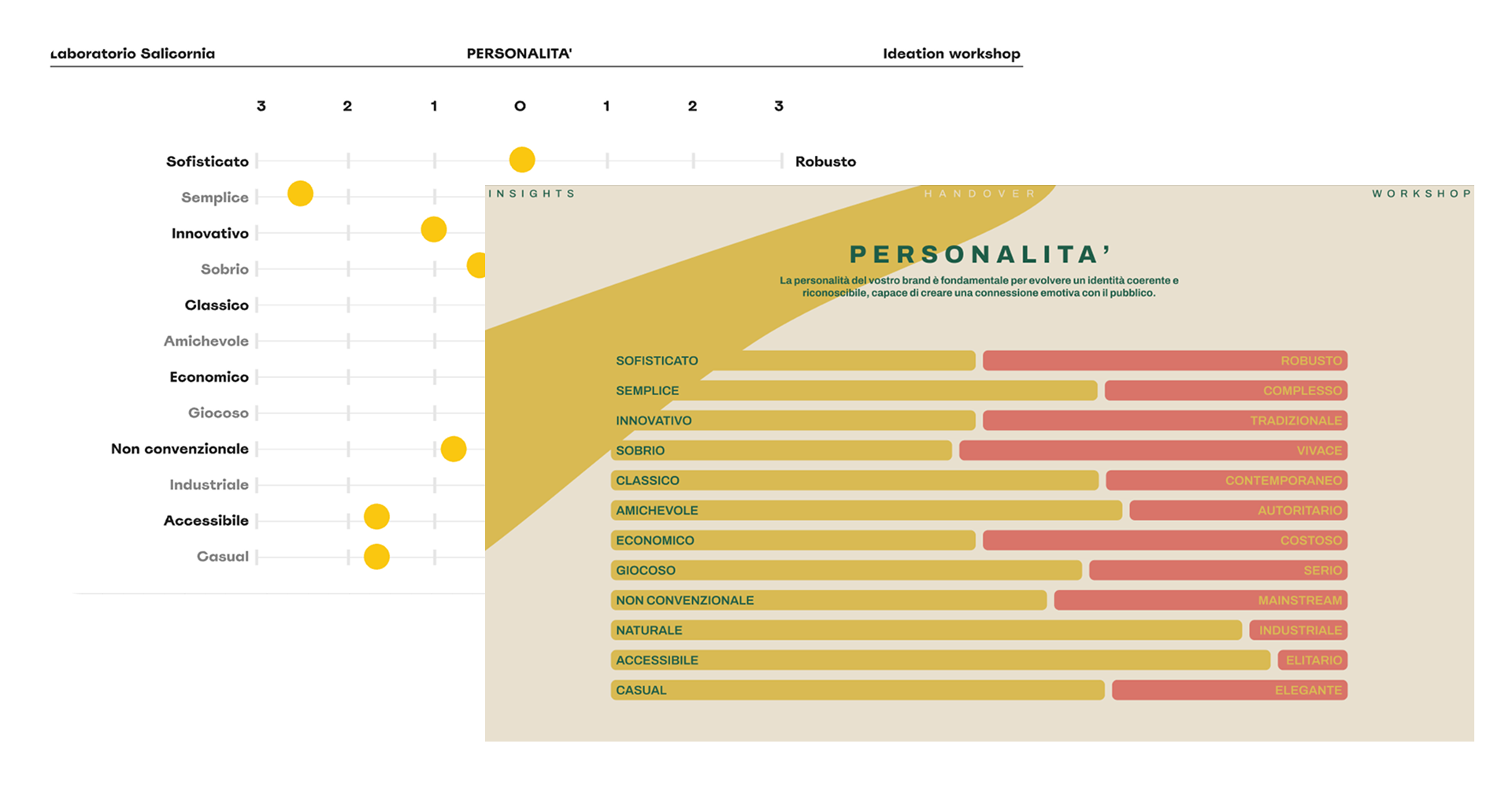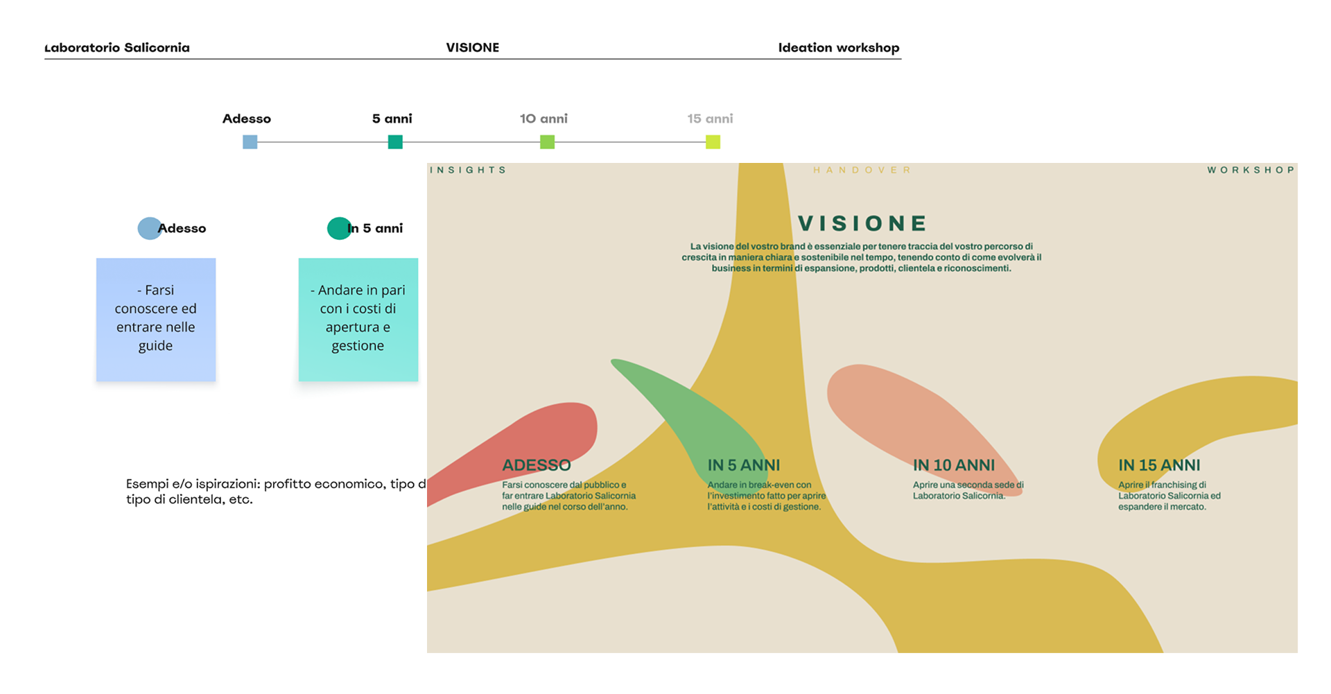
Laboratorio Salicornia is a new artisanal gelateria opened in Murano, Venice, in 2025. The two founders wanted an identity that reflected their values of craftsmanship, quality, and freshness. I guided them through a brand discovery workshop and created the full identity system: logo variations, color palette, typography, pattern, printed applications, and in-store visuals. Illustrations were licensed externally and integrated into the system.
I delivered a cohesive, contemporary identity that expresses artigianato, qualità, and freschezza — applied consistently across packaging, signage, and shop interiors.
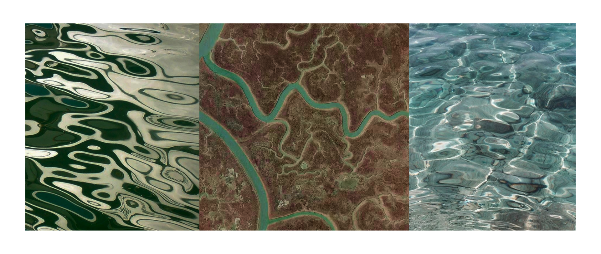
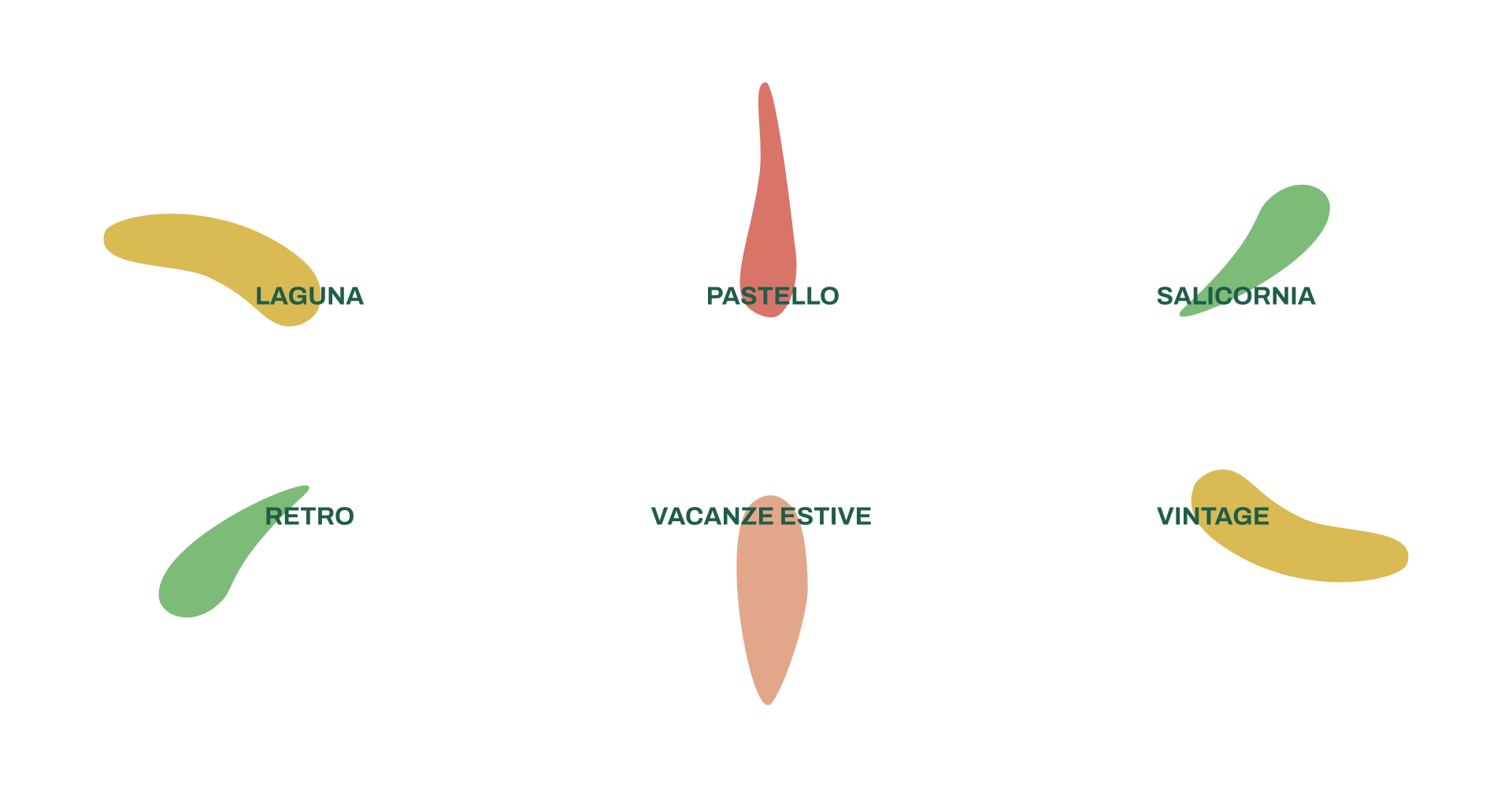
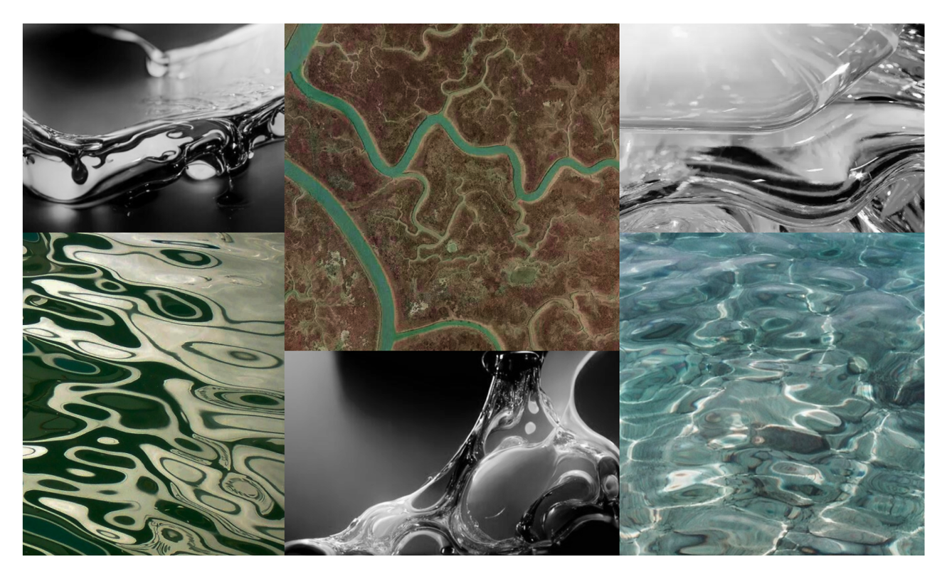
Inspirations
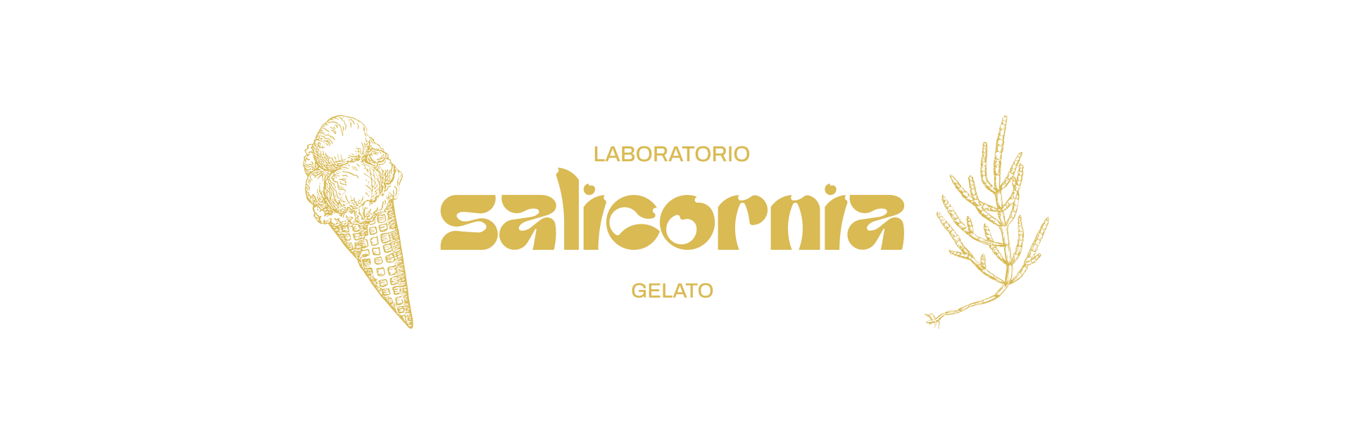
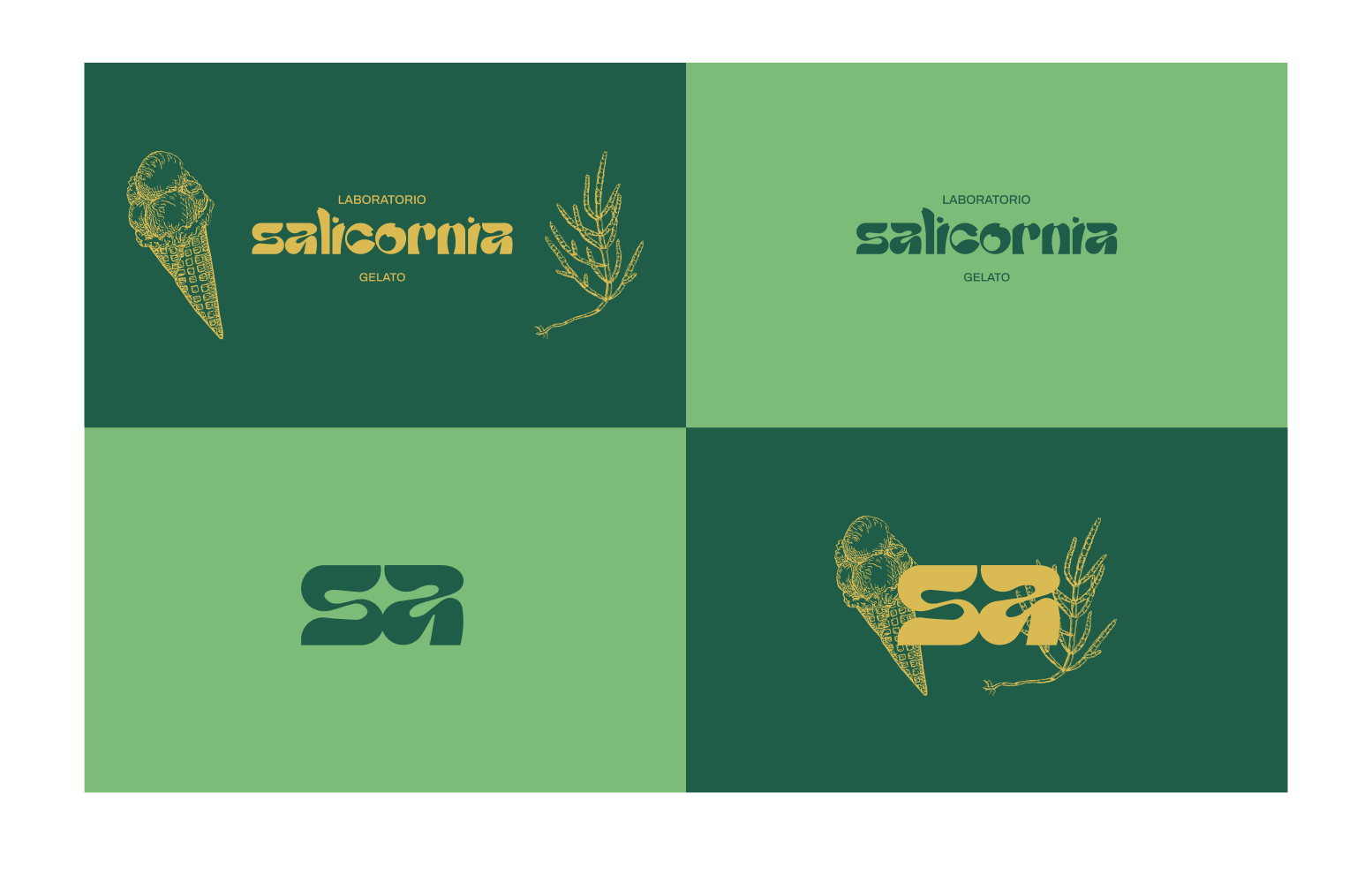
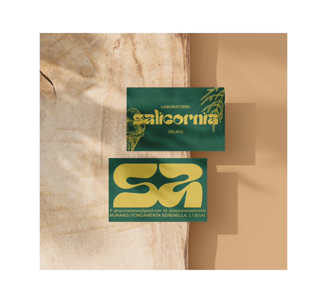
Full logo version
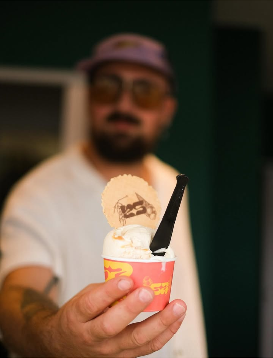
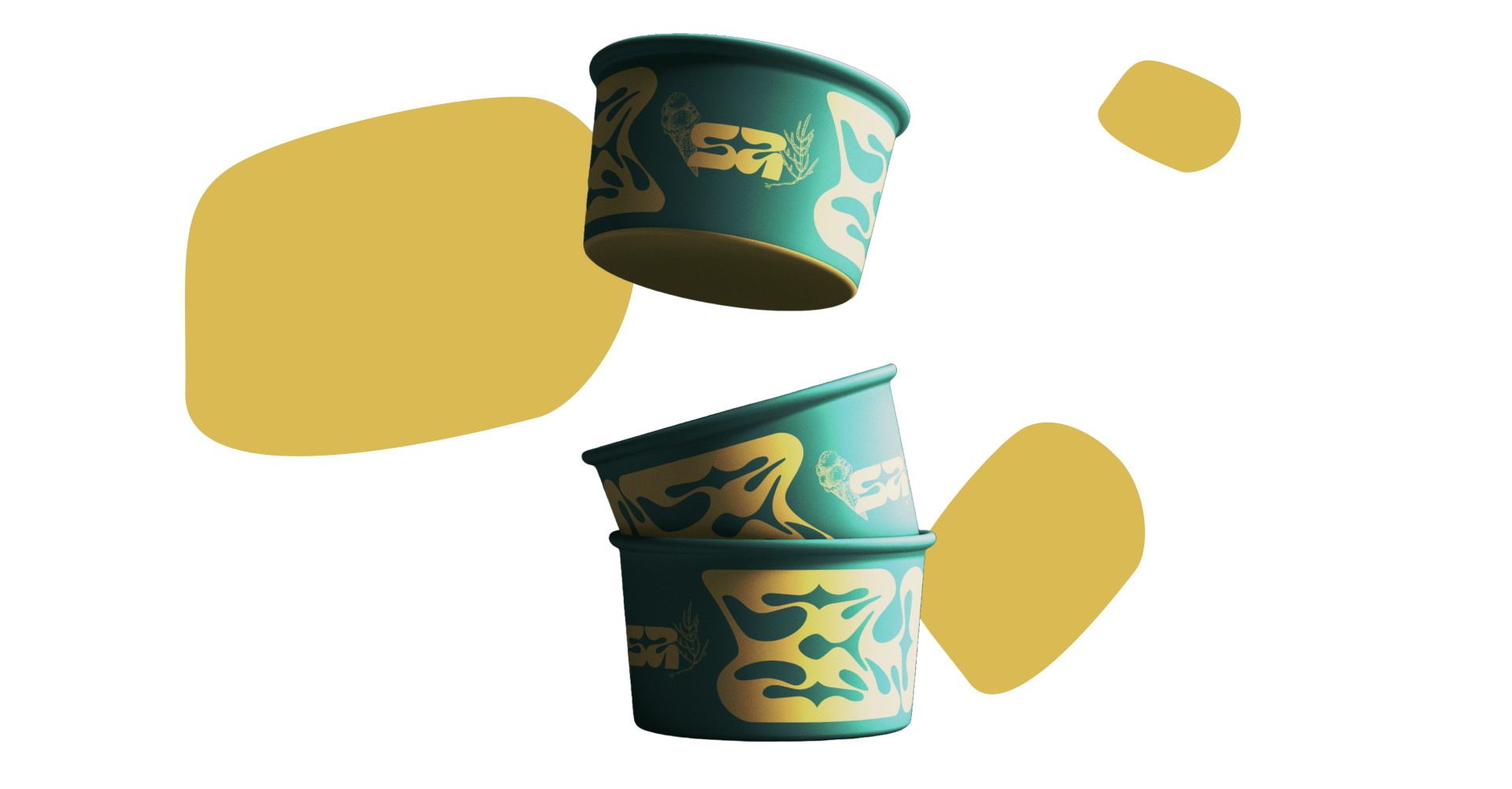
Gelato cup
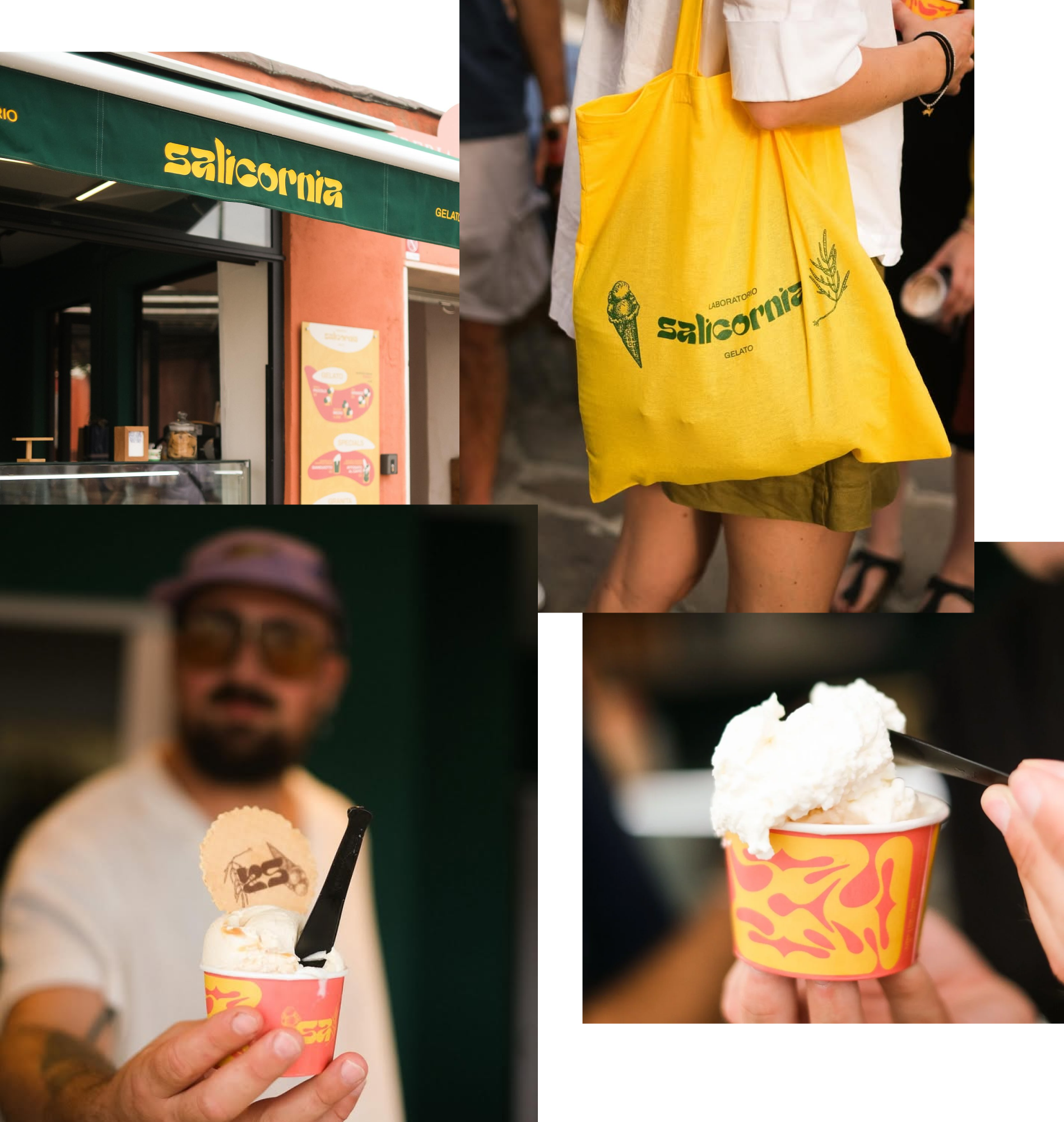
Photo by Ilaria Toma
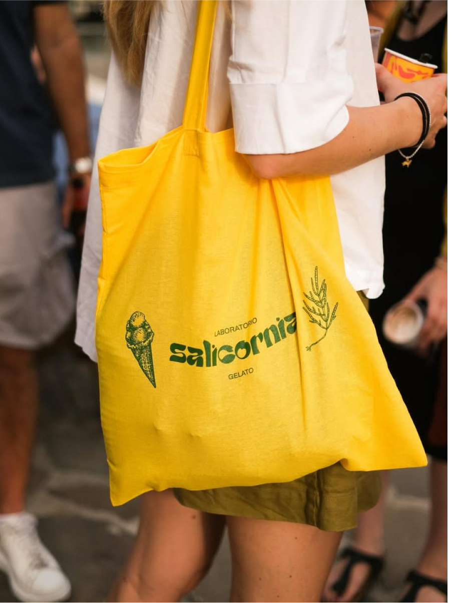
Tote bag
Photo by Ilaria Toma